The dashboards
Seven Grafana dashboards, each answering a different question. Every panel carries a description saying what it measures, how it is computed, and how to read it — hover the ⓘ rather than guessing.
💡 Before reading any of them
Two pages decide whether these numbers mean what they appear to:
- Agent capabilities — an empty panel is usually one agent not reporting a field, not a bug
- What the numbers mean — several figures are wrong in a flattering direction if defined casually
Executive Summary
Question: is AI-assisted work happening, and is it going anywhere?
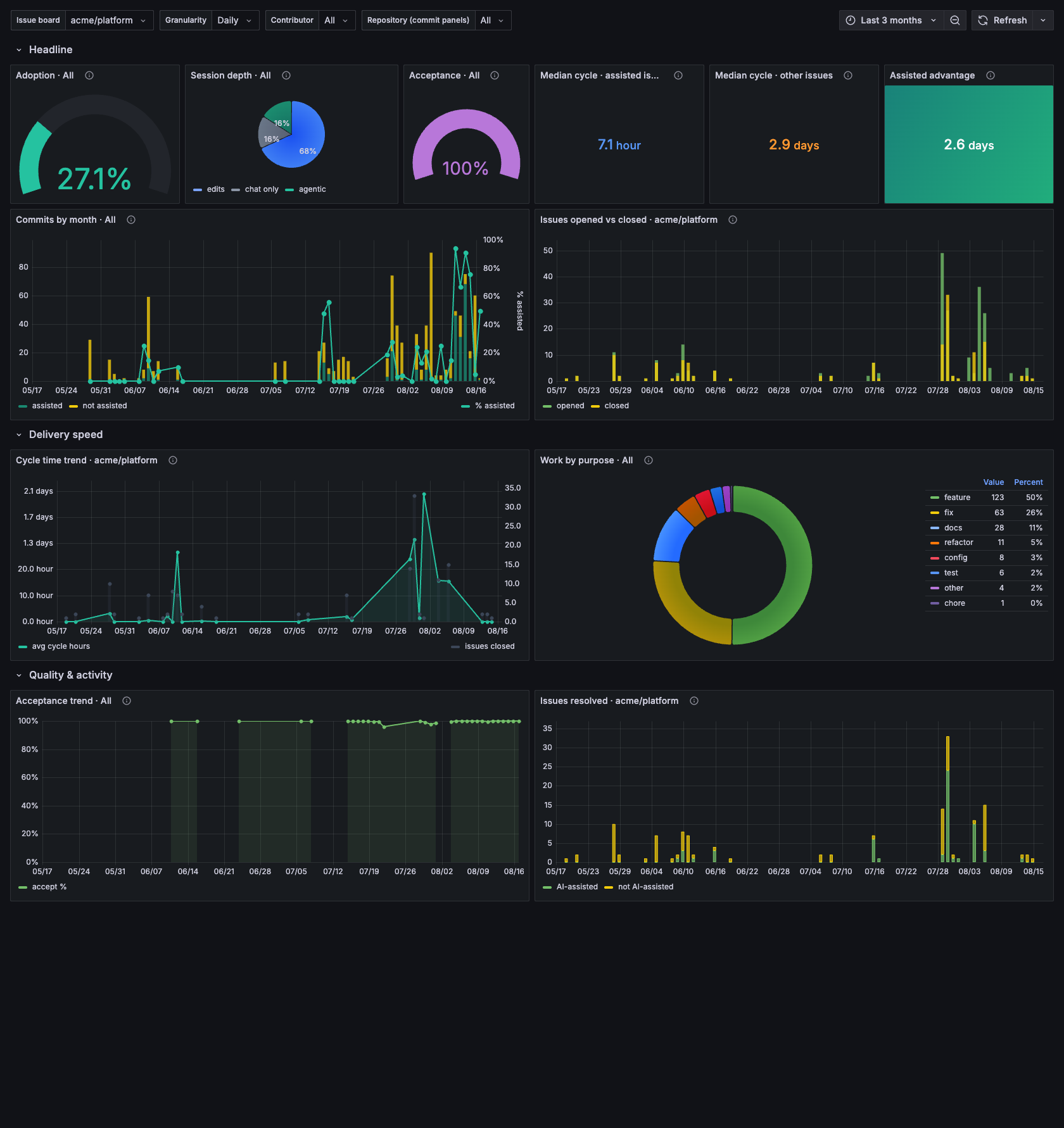
Assisted commits, attribution coverage, acceptance rate and the cycle-time comparison, with the issue-level detail beneath it.
The one-screen version. Assisted commit count, attribution coverage, acceptance rate, active sessions, and the trend of each. Built for someone who will not open the other six.
Adoption
Question: who is using agents, on what, and how much?
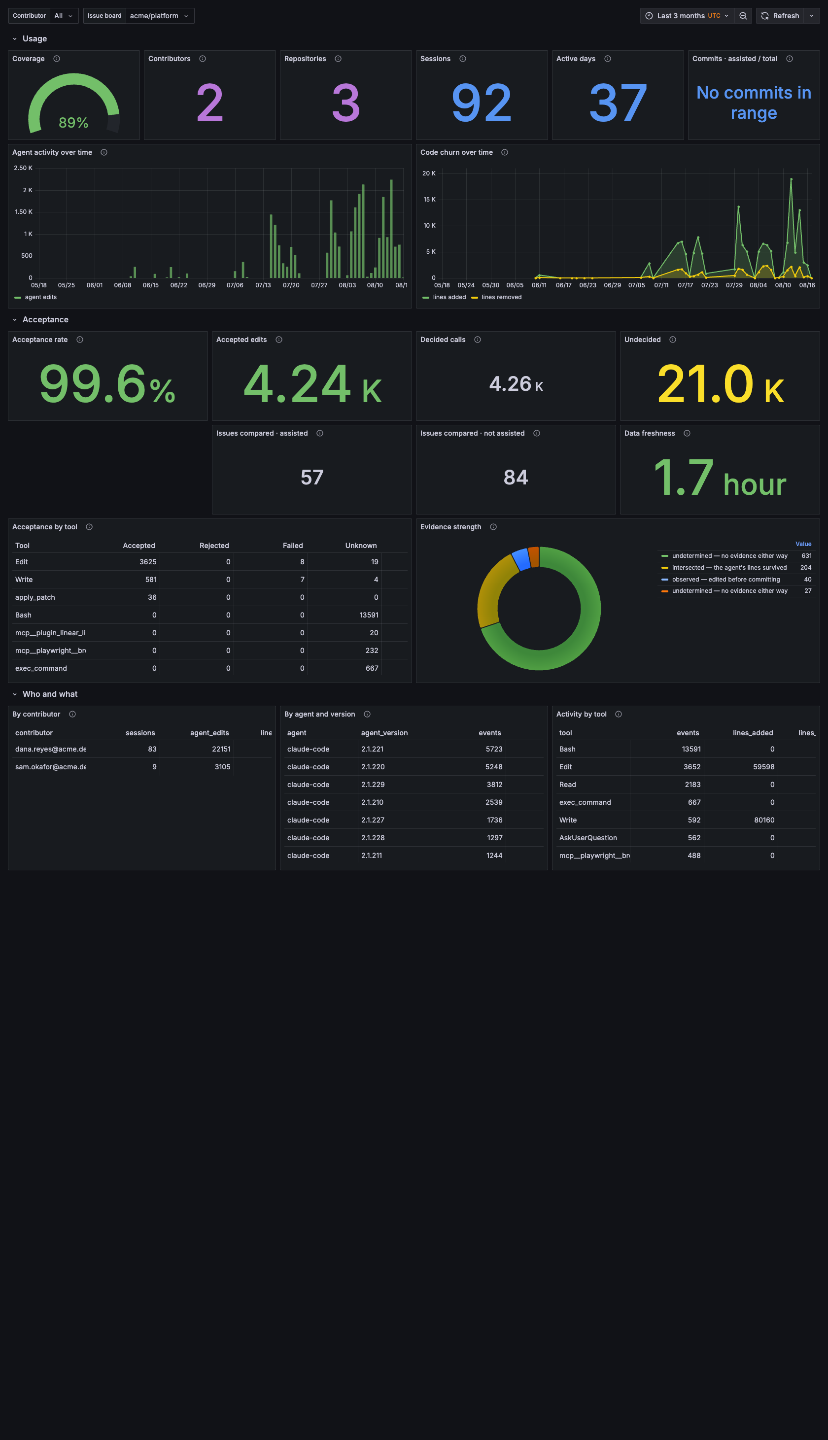
Sessions, contributors, lines written and acceptance — the denominators every other dashboard divides by.
Per repository and per contributor: sessions, agent edits, lines written, acceptance rate by tool, and the mix of agents in use. This is the denominator dashboard — where you check whether a figure elsewhere rests on three sessions or three hundred.
Cost & Efficiency
Question: what did it cost, in tokens, and where is that wasted?
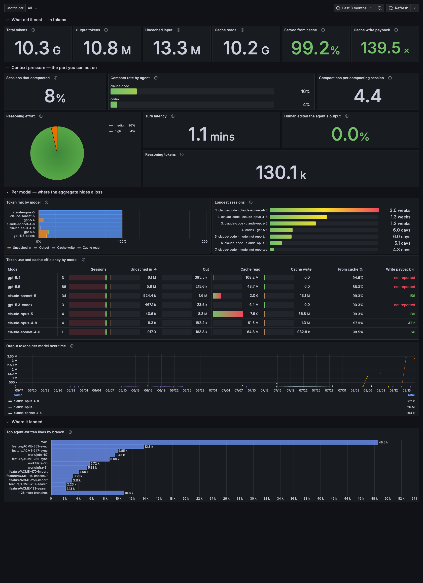
Token totals, cache economics and context pressure. Note the cache write payback figure, which breaks even at 1.25x rather than 1.0x.
Token use per model, cache read ratio, cache write payback with break-even drawn at 1.25x, context pressure and compaction rate, reasoning effort, turn latency, and the share of edits a human changed before committing.
The panel worth opening first is write payback per model: measured here, the aggregate was a healthy 3.60x while one model sat at 0.73x — a loss, entirely invisible in the total.
Structurally empty for Antigravity, which reports no tokens at all. The panels say so rather than rendering zero.
AI Impact on Delivery
Question: does assisted work ship differently?
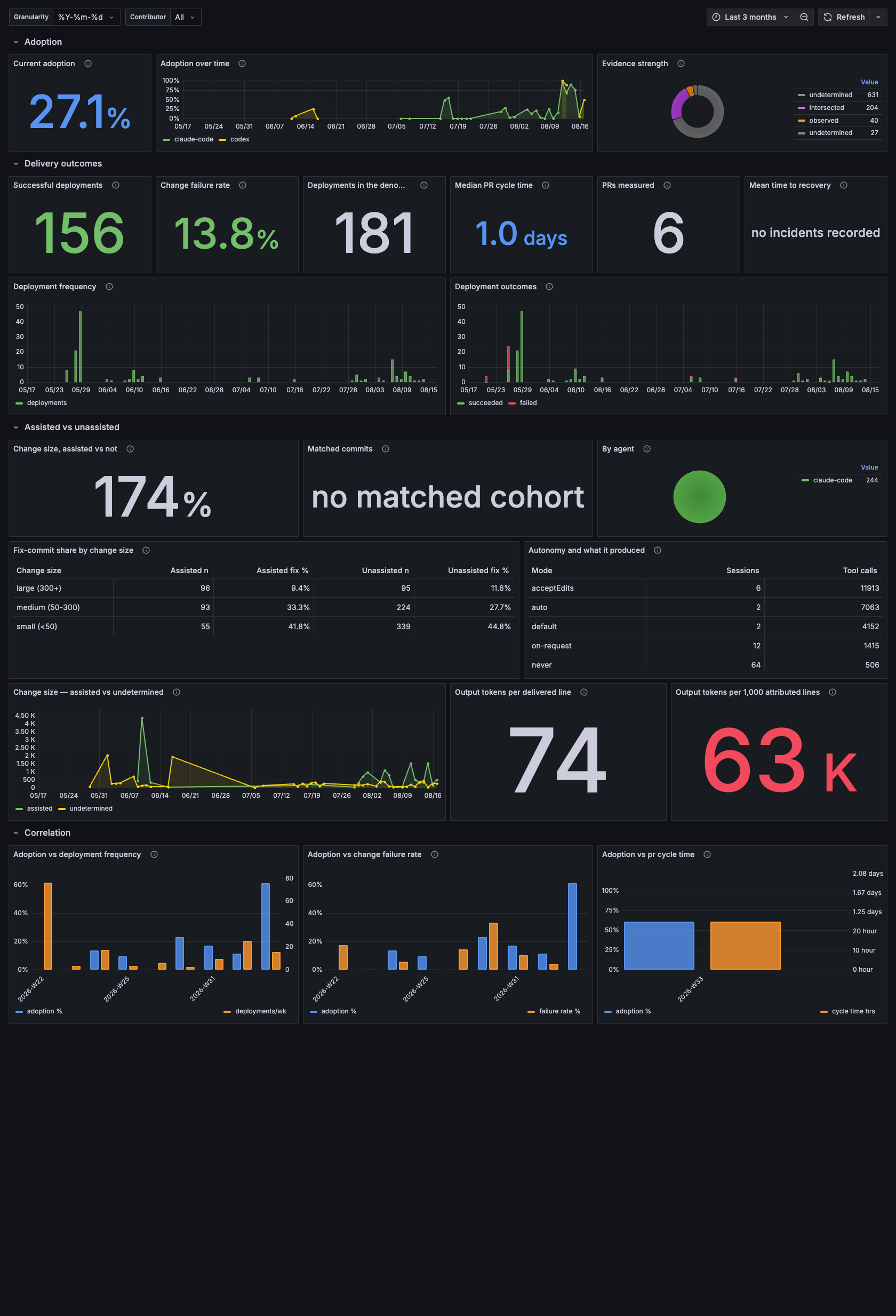
Adoption leads, because it is the denominator for everything below it; DORA delivery outcomes follow.
DORA-style delivery outcomes alongside adoption: deployment frequency, change failure rate, cycle time, and rework rate for assisted versus unassisted commits, matched by change size.
Read the caveat on every panel. This dashboard reports a difference, not a gain — assisted and unassisted commits are self-selected, so part of what it shows is which work people chose an agent for.
AI Productivity Funnel
Question: where does agent usage stop converting?
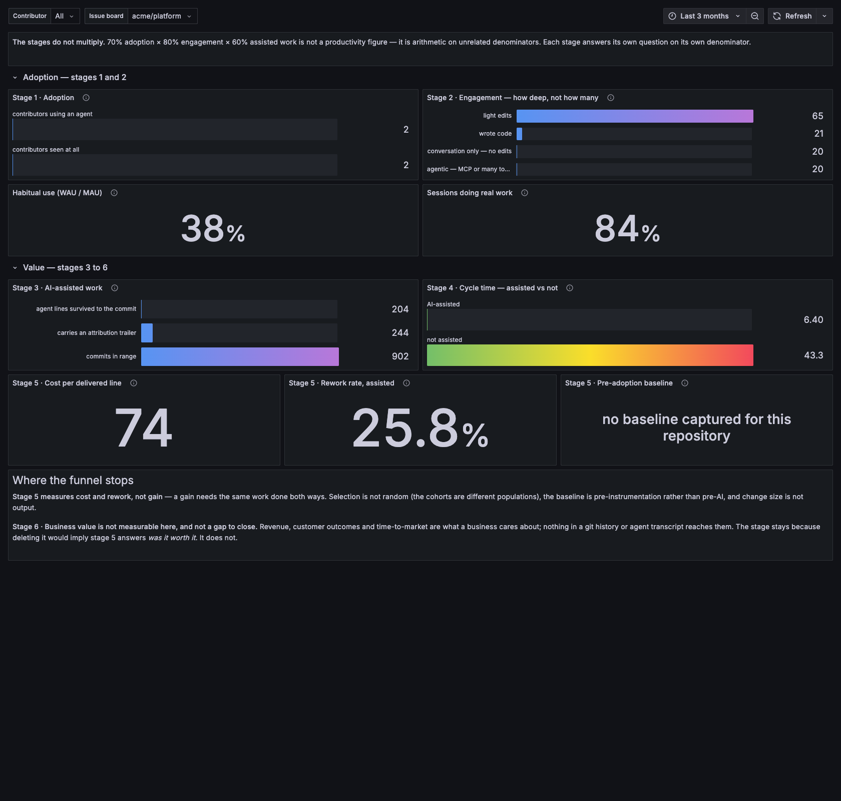
Six stages, each measured on its own — the header states plainly that they do not multiply.
Adoption → engagement → assisted work → acceptance → value. Each stage narrows, and the stage where it narrows most is the one worth acting on.
Stages that cannot be measured from the available data say so rather than being filled with a proxy.
Agent Activity Hours
Question: when is the work happening?
Agent edits by hour and weekday. Useful for spotting long-running background sessions, and for noticing that a "productive week" was one overnight batch job.
AI attribution
The original dashboard: coverage, method mix, and per-commit detail. Superseded in practice by Executive Summary but kept because it is the one that answers "is the instrumentation itself working".
Filtering
Every dashboard carries a Contributor filter. All is the default; the
dropdown also offers (unattributed) for repositories instrumented before
a git identity was configured, so no data is unreachable.
The screenshots on this page were taken against a database whose contributor emails, file paths and branch names had been replaced with demo values first. Nothing on this page is a real address or a real path — these panels do carry both, which is why the data was redacted at source rather than blurred afterwards.